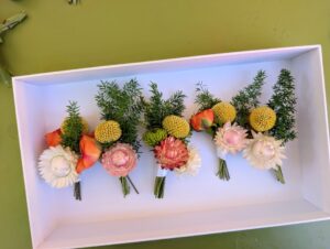
SWEET
details
Here’s what you should know about this palette!
the basics
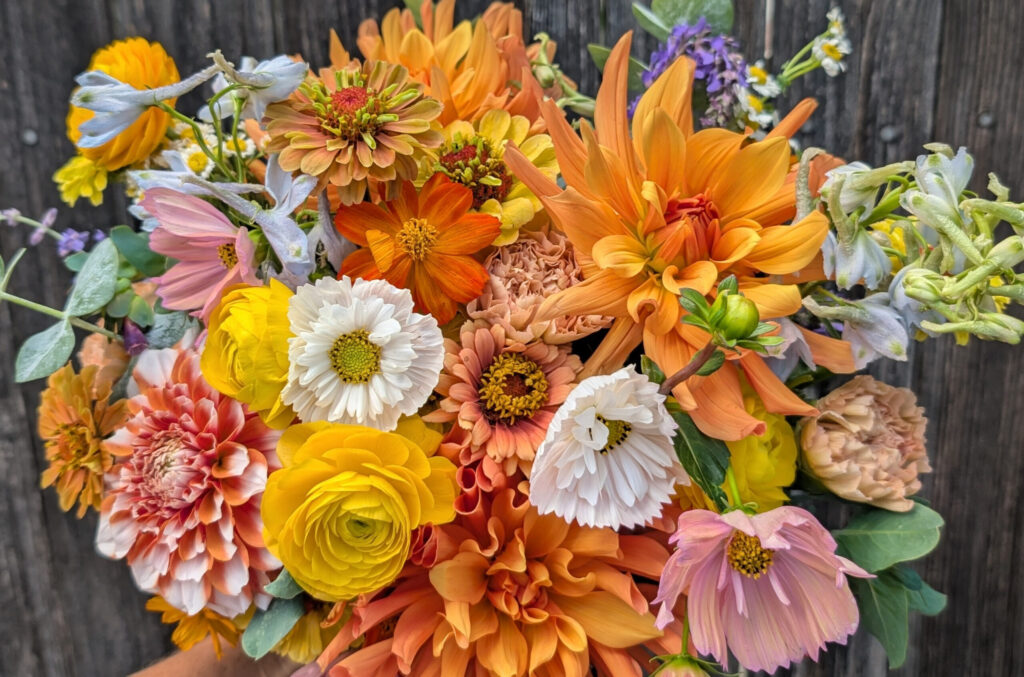
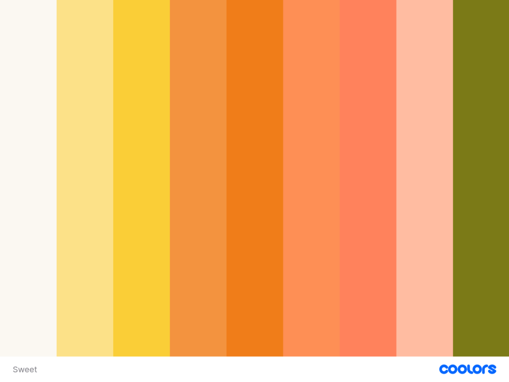
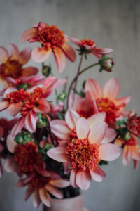
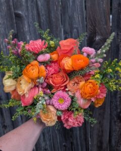
As an ardent lover of all oranges, peaches and corals, this is the designer’s absolute favorite palette. In its original form, it includes a variety of those tones, with little splashes of yellow and mid-tone pinks.
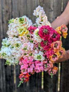
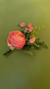
Common blooms in spring include ranunculus, snapdragons and feverfew (if you like a smattering of white).
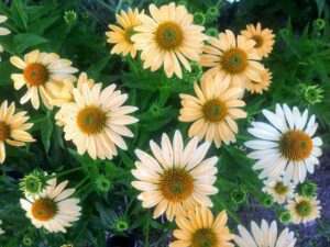
In summer, you’ll find cactus zinnias, Apricotta cosmos and a plethora of dahlias in your buckets and designs.
This palette pairs with bright green foliage such as bells of Ireland, cascading green amaranth, and fern.
The spirit
The sweet palette is all about those sugary, citrusy tones for a cheery, color-happy feeling for your wedding. You can see the sunshine concentrated in the blooms, which tend to be densely packed with very little added texture from grasses or pods (though of course, more textures are available upon request). This palette is all about the abundance of focal flowers we grow in our fields each season.
variations
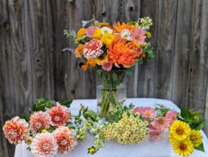
As seen in some of the photos, pale blue is a common and absolutely beautiful addition, as is white. Others eliminate the yellows or add fuchsias. We love featuring these colors and would happily play with the palette to make it yours.
Because we design with what is thriving in our fields each week, individual flower varieties and exact shades will vary throughout the season while staying true to the overall palette and spirit described here.
As always, if you’d like help determining which palette would be best, or how to customize, feel free to reach out!